Mosaics of Movie Poster Cliches
Ever notice how so many movie posters are really similar? As a French film distributor, Christophe Courtois is a poster expert that has seen enough of them to know what he is talking about. After noticing that many posters use the same hackneyed ideas and designs over and over again, he decided to create a blog that highlights these banalities, dividing each cliché into individual mosaics that contain similar movie posters. We’ve highlighted some of his most amusing mosaics. Movie advertisers and marketing experts, take note!
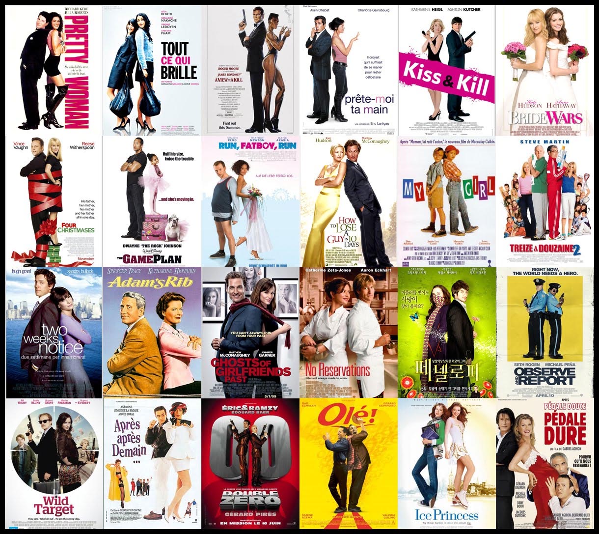
The Back-to-Back Pose:

This design cliché is especially prevalent in romantic comedy posters but the rationale behind it is not particularly clear: Is it some kind of gender equality statement? Does it highlight the closeness of the two protagonists? Your guess is as good as ours. Extra marks go to the posters that show the female lead folding her arms, which evidently shows that she is distinctly unimpressed with her male counterpart. Or perhaps it is meant to accentuate her ballsiness and strength of character (before she falls head over heels in love with the guy of course).
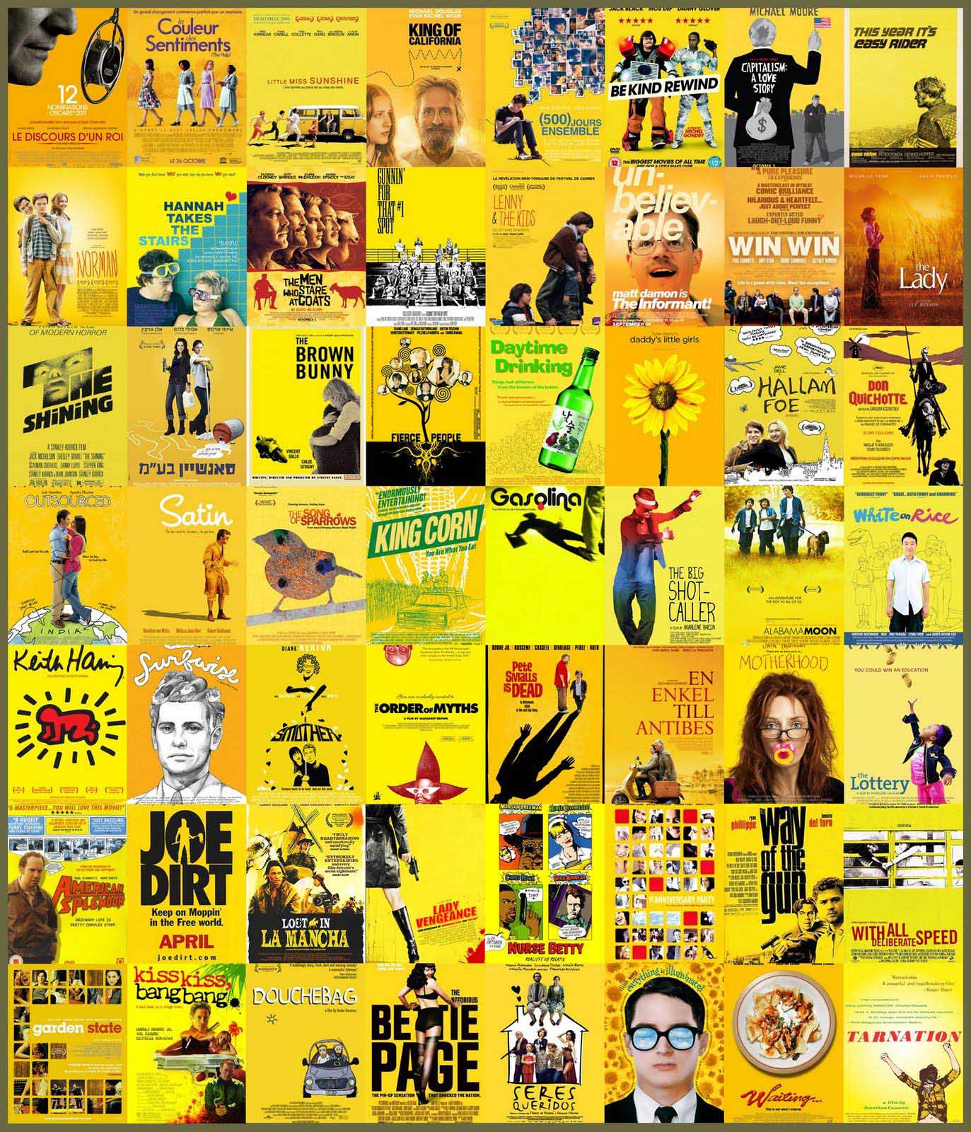
The Quirky Yellow Indie:

Ah the indie film: A bastion of playful kookiness and unconventionality, usually sountracked by The Shins or other similar indie outfits. However, for a movie genre – and it has definitely become a genre – that strives so hard for originality and uniqueness, it is a bit too fond of the color yellow in its posters. After thorough research (i.e. searching “yellow” on Wikipedia), it would appear that the color represents “sunshine, reason, optimism and pleasure”. You can understand why a marketing team would go for it, but how about some more originality in the future?
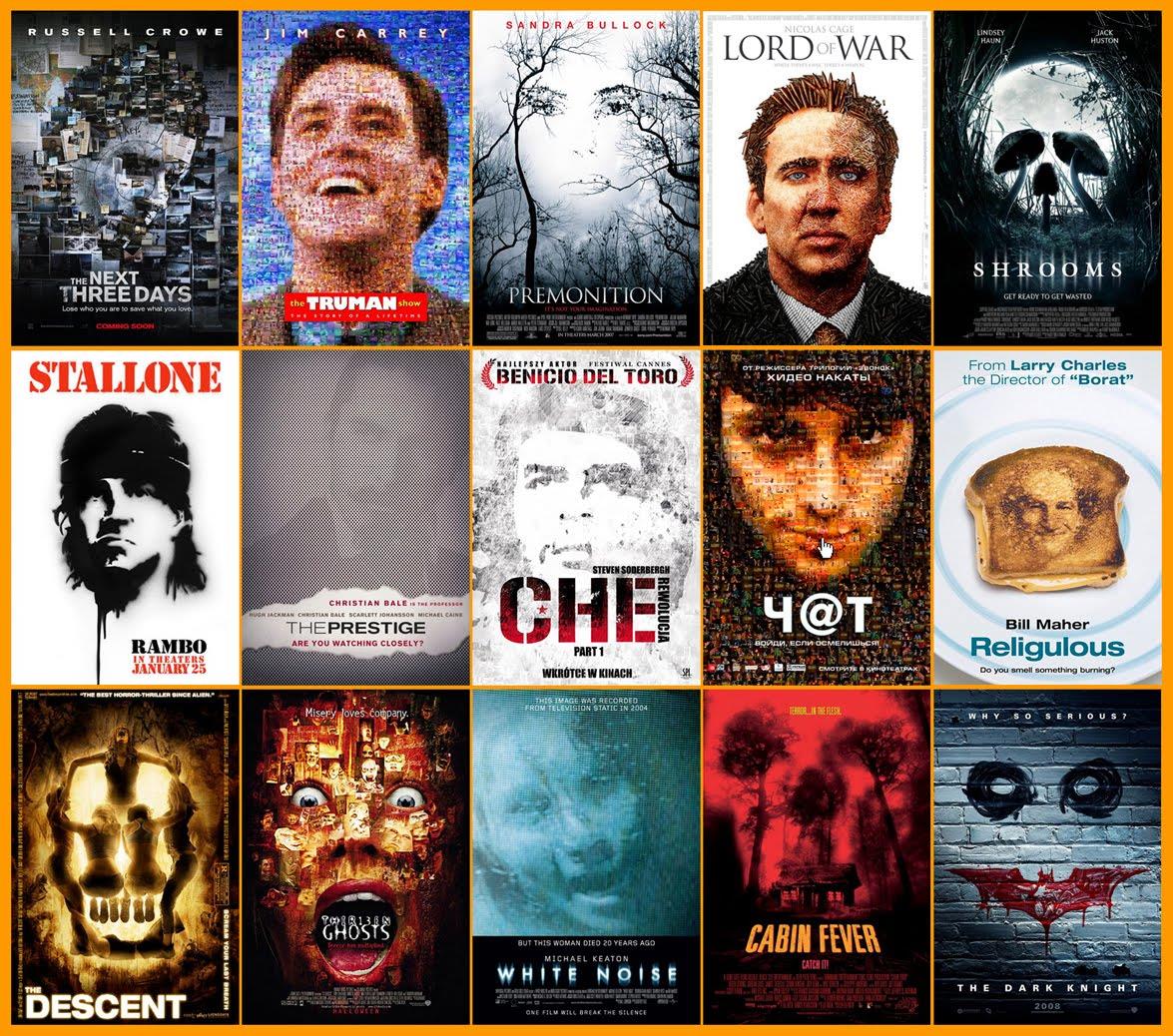
The creative “face on a poster”:

If you’re coming up with a movie poster design, simply plastering the protagonist’s face over the movie title isn’t going to cut it. Thus, marketers are forced to come up with more ingenious ways to sell their film. A common poster tactic is the face made of mosaics, most notably seen on the poster for the wonderful “Truman Show”. Courtois has compiled posters of this method (and some other face designs) in a mosaic. Mosaic within a mosaic anyone? This is starting to feel a bit like Inception. Speaking of which…
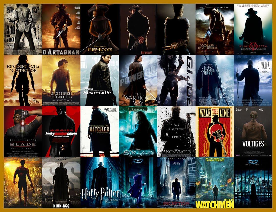
The back turned pose:

Inception does provide us with the typical action movie back turned pose (on the bottom row), but it is by no means the only offender: Spiderman, V for Vendetta, Watchmen and many more are all guilty of it as well. Of course, this poster design wasn’t going to slip through Courtois’ fingers and he duly conveyed this prevalent cliché through a mosaic. This design is perhaps meant to position the movie protagonist as a badass character, gazing into the horizon. You can also notice a slight deviation from the norm in some posters that add a sideways glance, allowing moviegoers to catch a glimpse of the usually stern and tough hero (see Shoot Em Up and The Sorcerer’s Apprentice). So there you have it. To be fair, most of these designs are actually beautiful and attractive. Yet through his mosaics, Courtois has managed to portray the distinct lack of originality found in Hollywood nowadays. Check out more of Courtois' work here: http://affiches
